OracleBio
2021
Brand
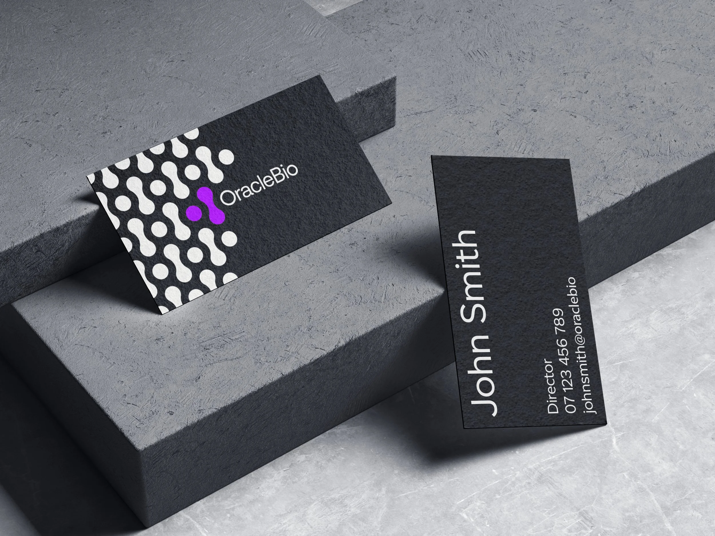
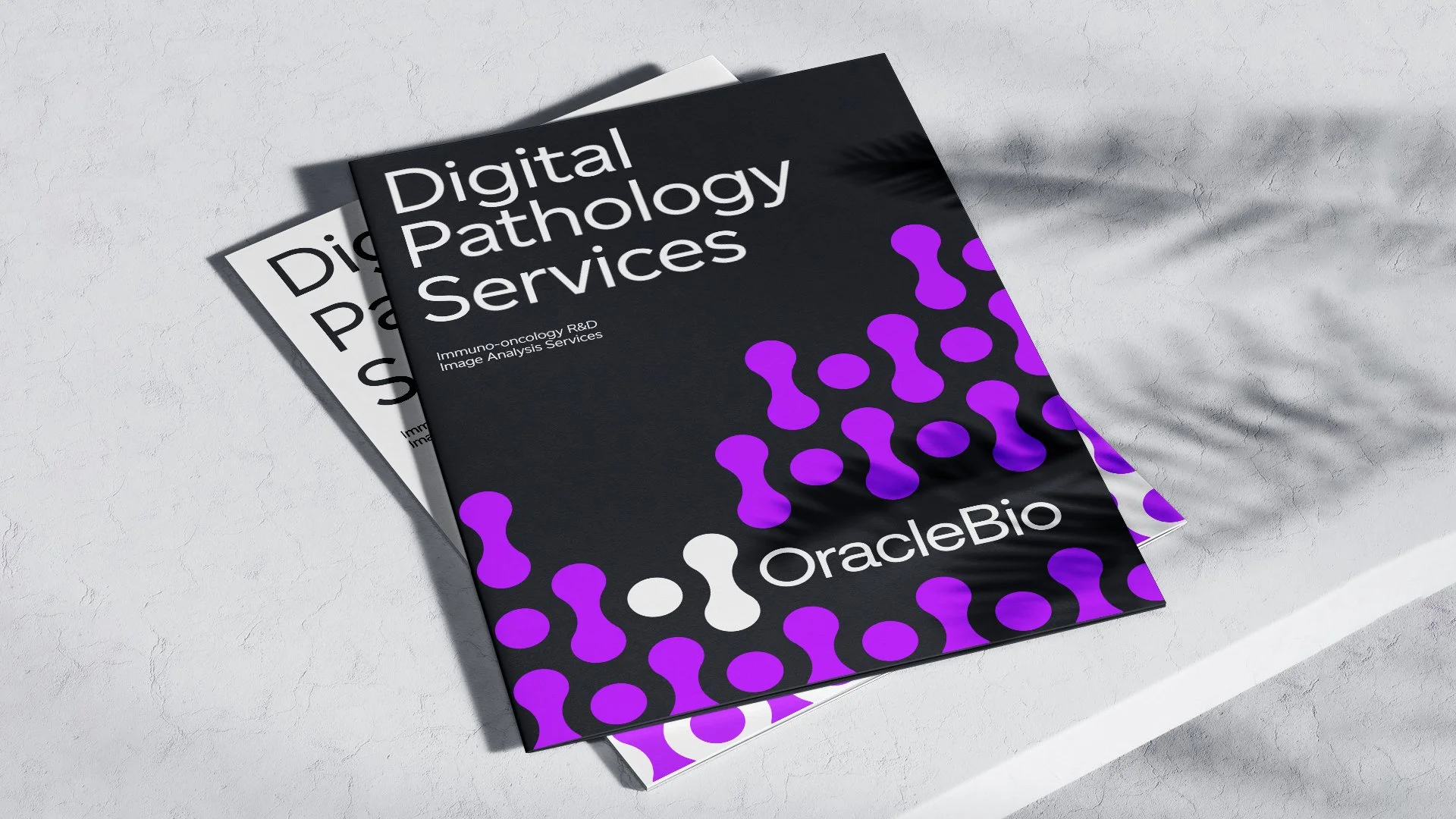
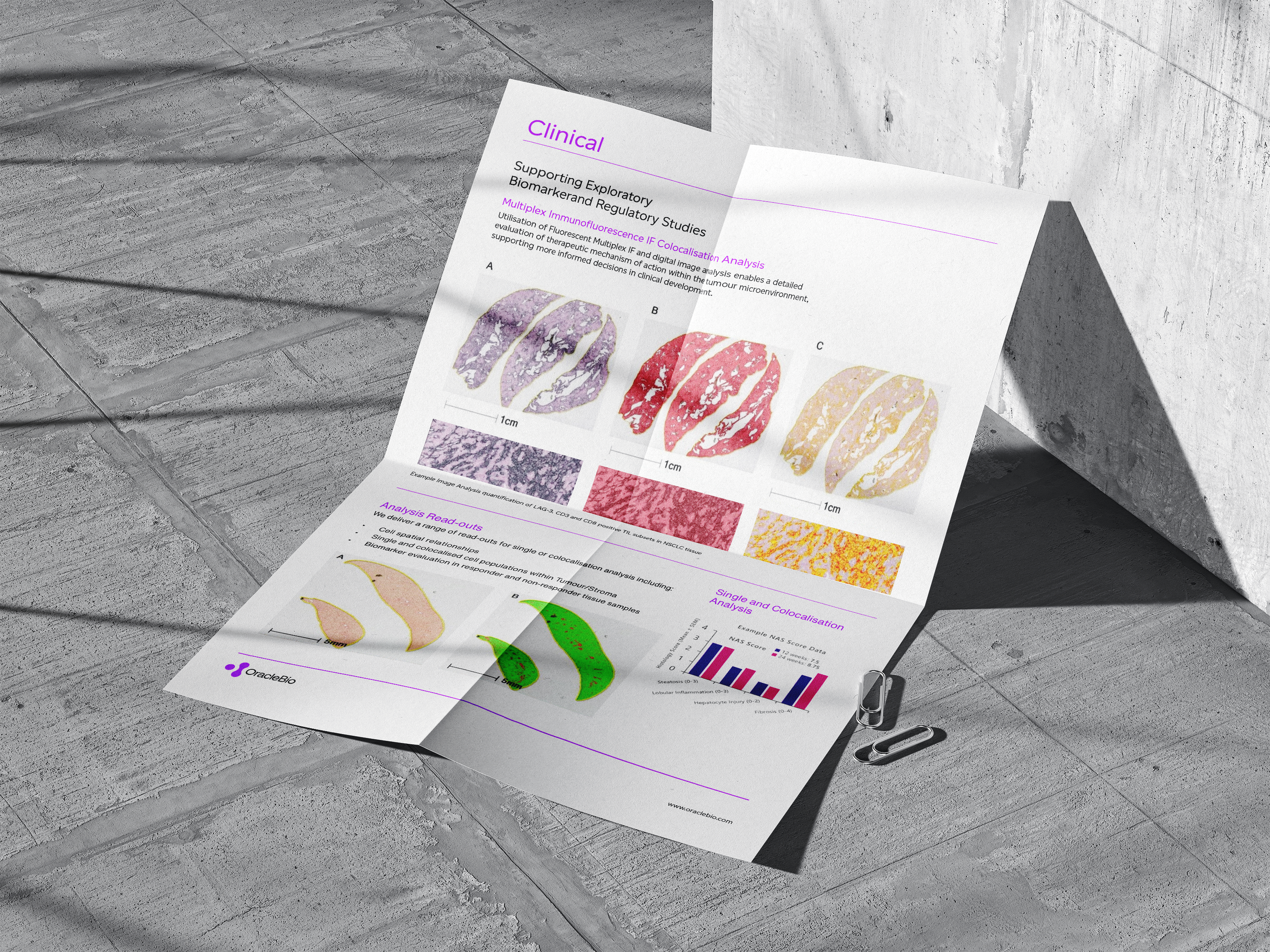
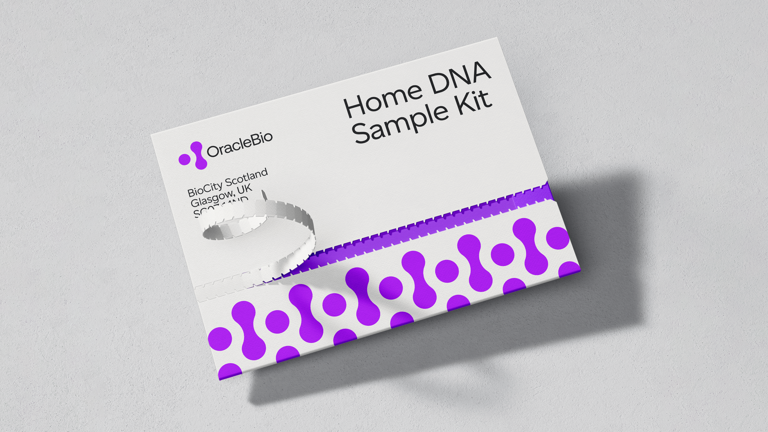
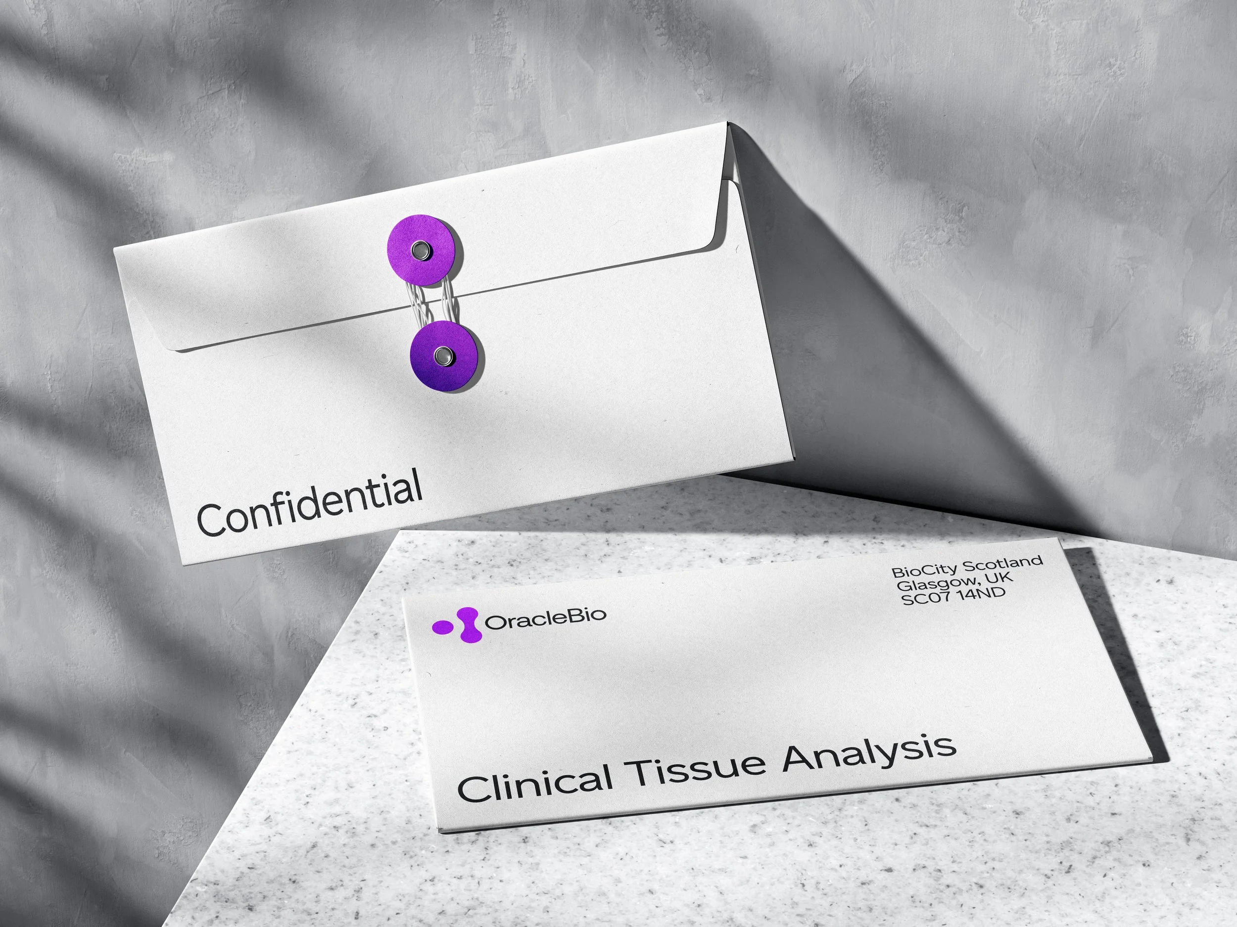
A developed brand concept for a global leader in quantitative digital pathology. A data driven company providing image analysis services to Pharma and Biotech clients worldwide. A design system built from an alluring view of cells dividing, it draws inspiration from the tissue analysis done by OracleBio, a world and a technology that's ordinarily hard to perceive. The OracleBio logo dives deep into the cellular scale, zooming in on the cells themselves, the centrepiece of the OracleBio’s work. The symbol and word-mark are at the centre of the new identity and are both constructed using a simple dot grid system. Representing the division of cells. Additional patterns created using circles (echoing the precise elements of the OracleBio logo) feature playful and rhythmic compositions. These appear throughout the identity and are employed for social media or branded material.


